CMS - Finnoscore
CMS
We have a Content Management System (powered by STRAPI) to manage dynamic content for the FinnoConsult websites. Visit this page to access CMS admin: CMS Login.
The CMS is password protected is required, you can by contacting dev@finnoconsult.at
Finnoscore
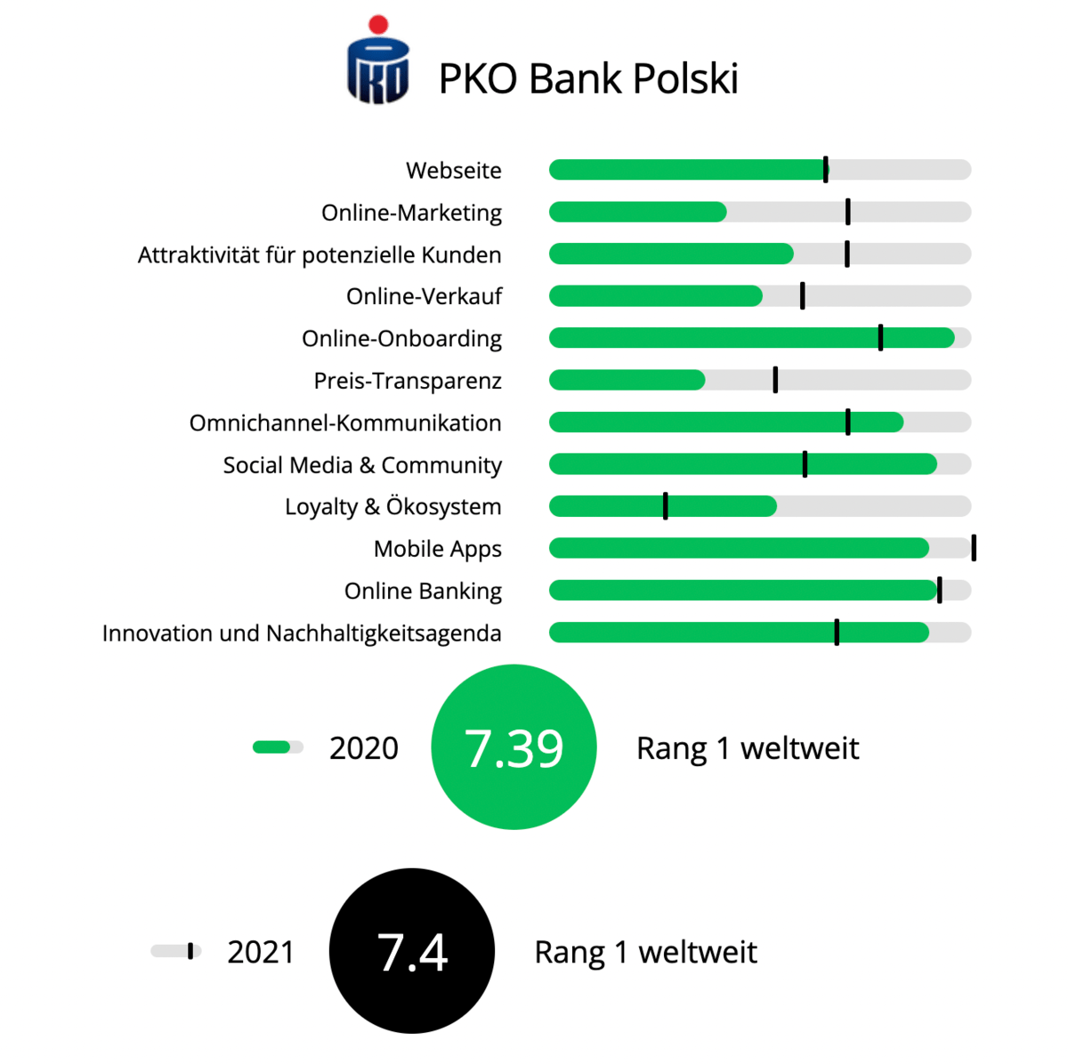
The Finno Chart generator & Innoscore tools utilise the data from the CMS. Innoscore data is managed manually on local machines separately as Excel, and finalized separately from this website using macros.
Both the official finnoscore tool and the protected Chart generator tool uses the same input data from the CMS.
Upload Bank/Insurance
There are several ways to upload a new finnoscore dataset. You can do it directly from chart generator, but also you can use the Strapi CMS to upload an excel file.
In Strapi:
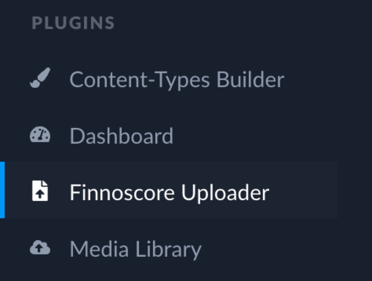
- Choose Finnoscore uploader on the left sidebar
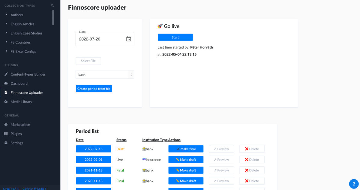
- You should see the following page
- Pick a date/period
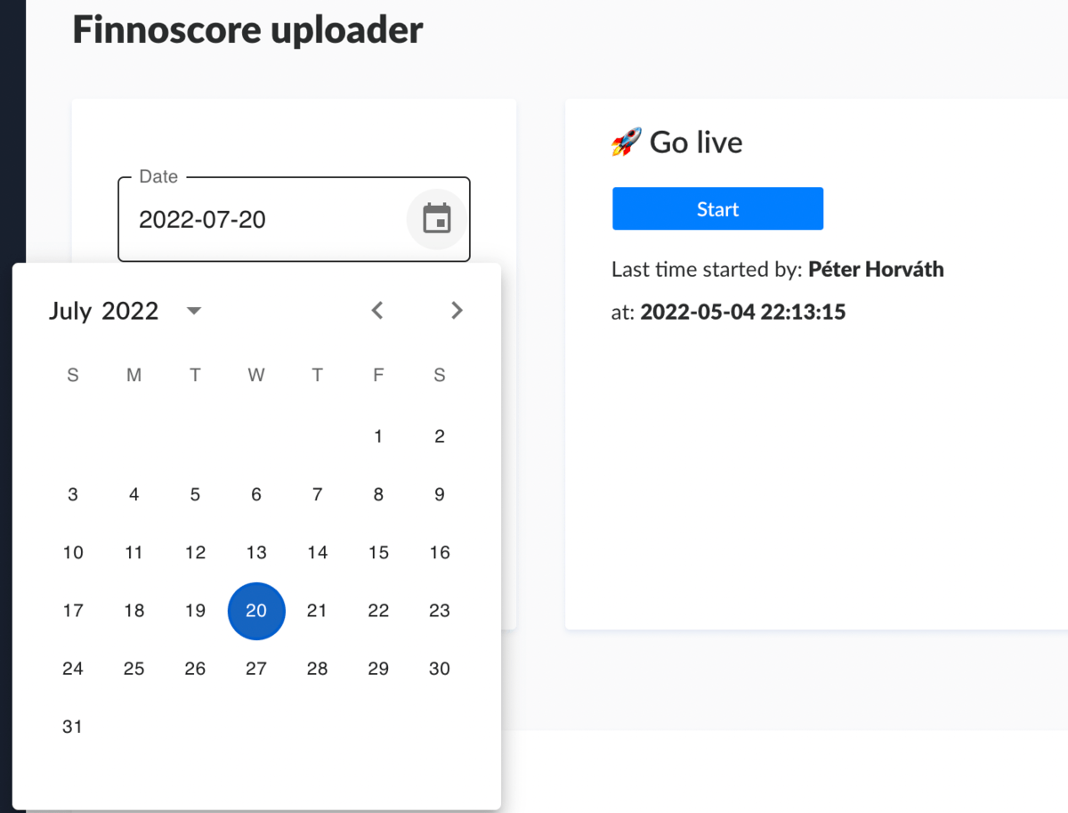
- Be careful, if you don't want to overwrite an already existing file, don't use an upload with the same date!
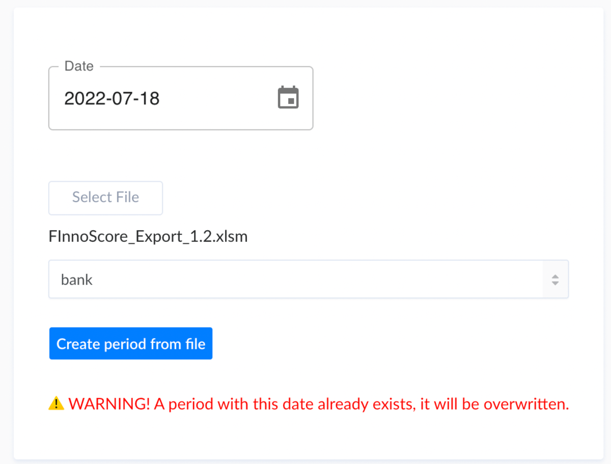
- Select the file you want to upload
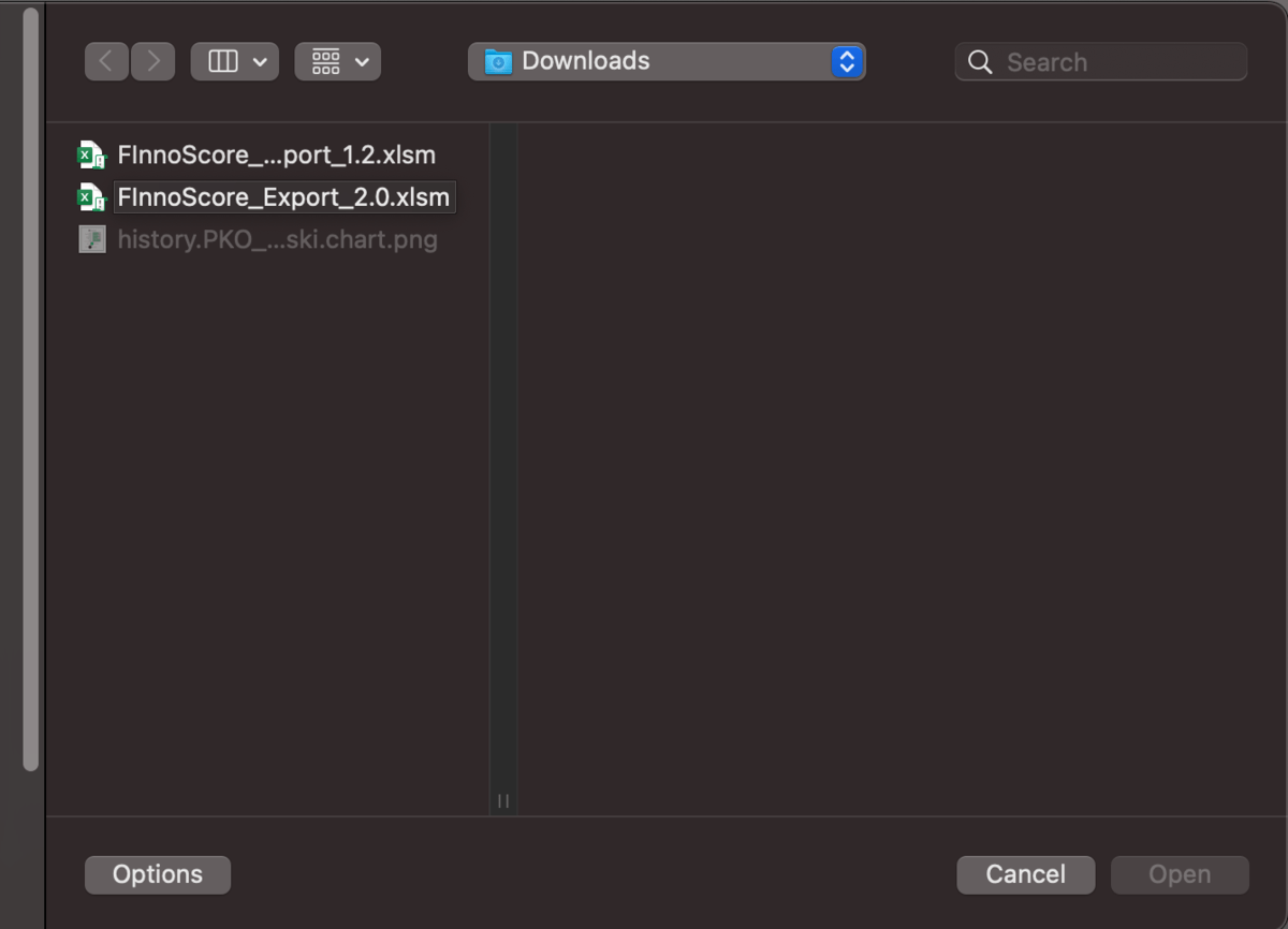
- After a successful upload you should see your file below:

On the Website Innoscore-Uploader:

- If theres an error it will display to you with a notification modal:

- Else it will successfully upload the file to Strapi CMS:

Preview draft data in Innoscore
- You can preview your uploaded data by clicking to the PREVIEW button
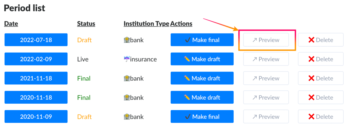
- It will navigate you to FinnoScore tool, and then starts to load your previewed data
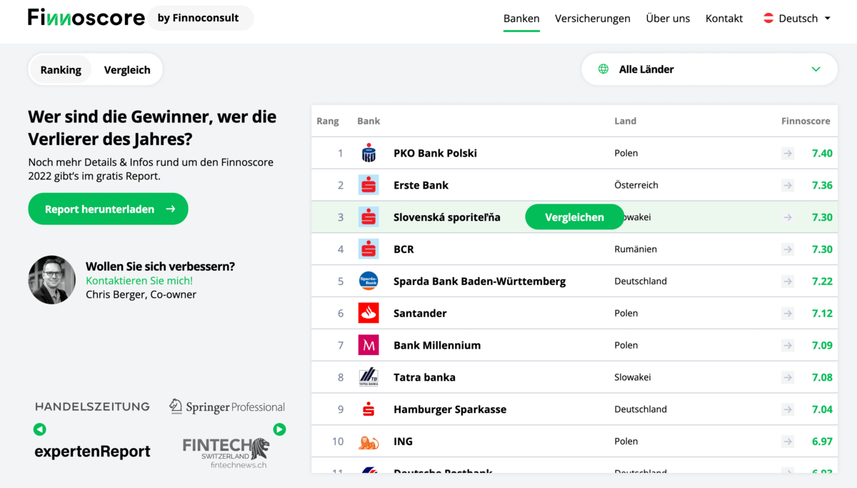
- If you notice that an image (bank logo) is missing, it is likely that the required asset is not uploaded to the CMS. Look at how to upload an asset to the Media Library

Statuses
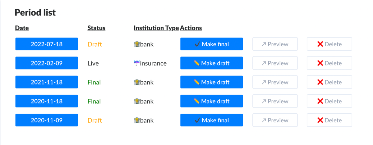
Status can be Draft | Current | Previous | Legacy. Initially it becomes Draft on data upload, but then we Finalize a particular dataset. The very latest Final status would be considered as Current (used by Finn tool), comparing trend graphs to Previous Finals. All previous (meaning, more than 2 years old), would become Legacy.
When you use the chart generator you usually want to use DRAFT statuses.
File Format
Uploaded file format should be XLS, XLSM or any Excel compatible extension, also it has to match our column format configuration.

Previously uploaded files can be opened for reference from here.
Manually adjust Excel file
- Open the file you want to edit or create a new Excel document.

- Select the row you want to edit or select an empty row/cell after existing data. To select an entire row you need to click on the row number at the left side. After you have selected the desired row, just copy (Command+C | CTRL+C) it, then select the target cell where you want to paste it. Paste it with Command+V (on Mac) or CTRL+V (on Windows).

- Now that you duplicated the row, you can easily edit the data to whatever you want.

- Important!!! In the excel file Import Banken tab, the Logo (FileName) should be the exact name of the logo you will upload to the STRAPI media library. In the excel file, you don't have to upload the image, it is just the name of the bank logo. Strapi will search in the media library for the same image name you added to the excel file.
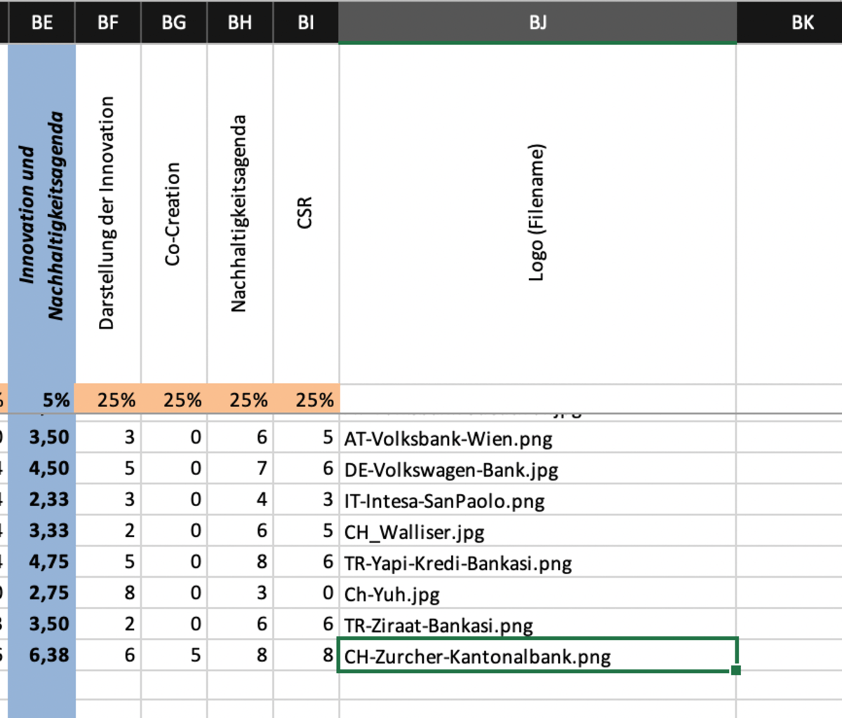
- After you have achieved your goal with the editing, save the file and upload it to the cms in the strapi file uploader.

Upload image in STRAPI CMS
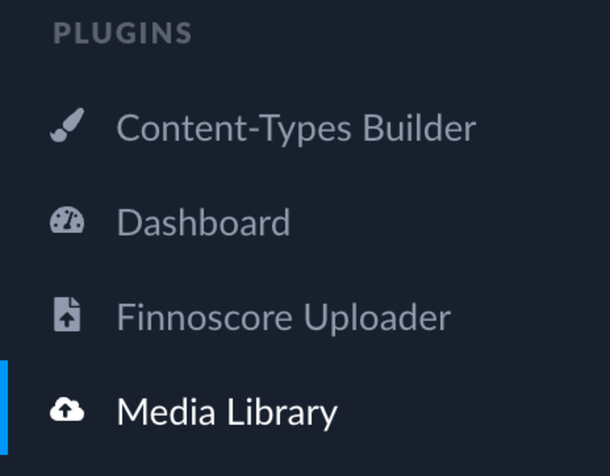
- Go to Plugins -> Media Library on the left sidebar panel in Strapi
- Go to Upload Asset on the top right corner

- Upload a single asset or multiple assets.
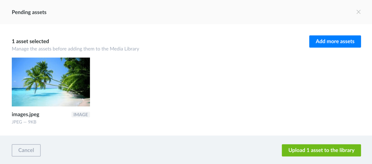
- Open your uploaded asset with left click

- Important!!! The name of your file should be the exact same name that you gave in the excel file to your Bank logo (FileName).

- Add an alternative text to your image so we could have better SEO results!

- You also have options to delete, download, copy link or crop the image.

- Finish the upload by clicking to the finish button

Search images in STRAPI
- Go to the search bar.
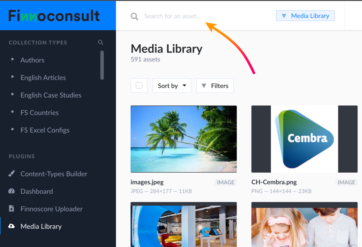
- Search for the NAME of the image.
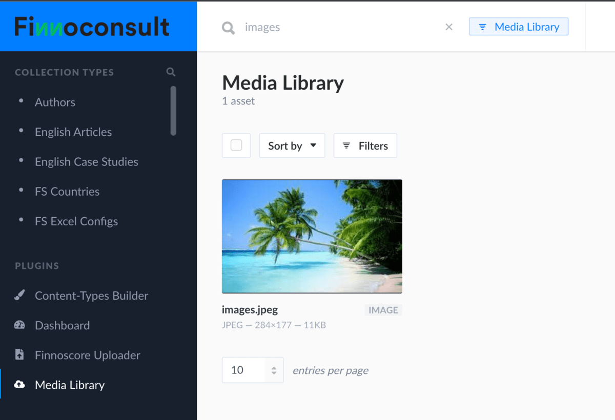
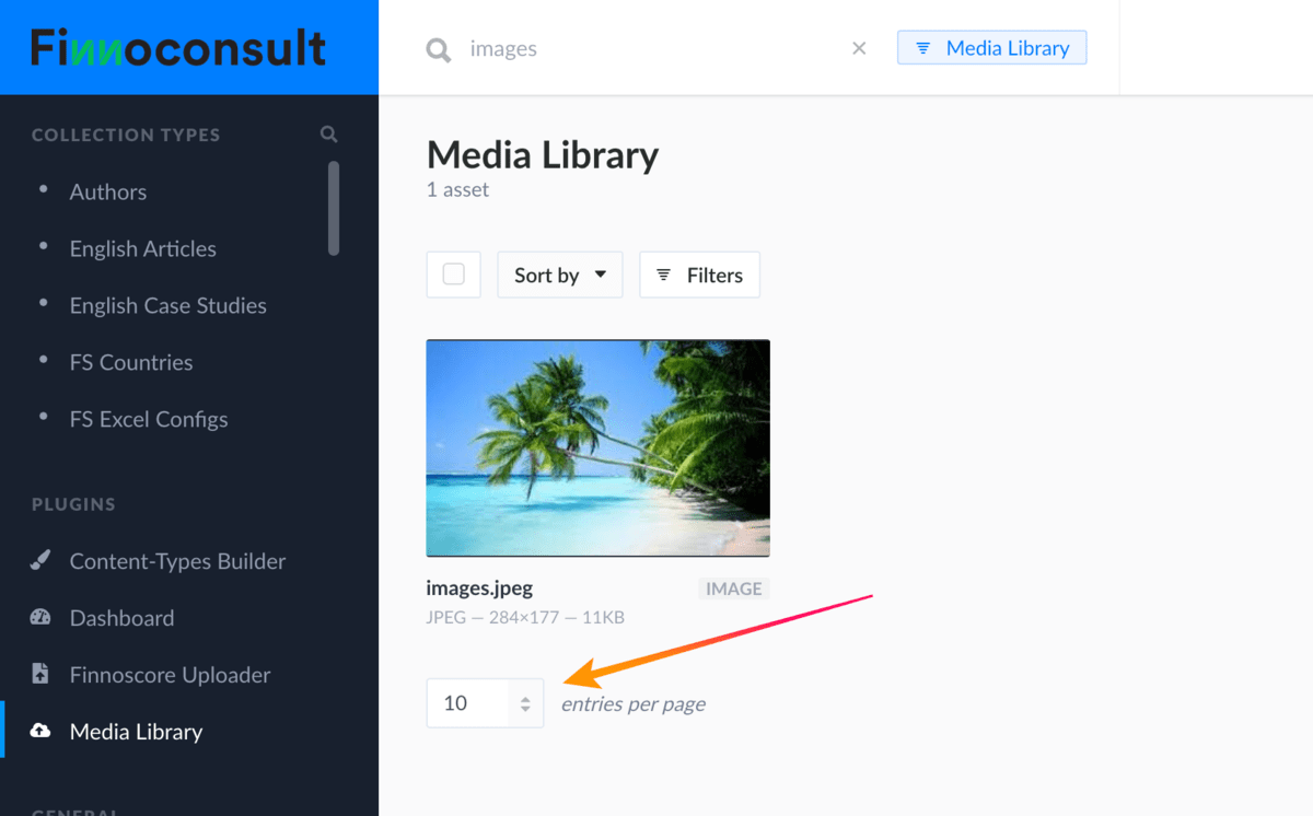
- If you have multiple results, you can expand the count of it by clicking the button below.
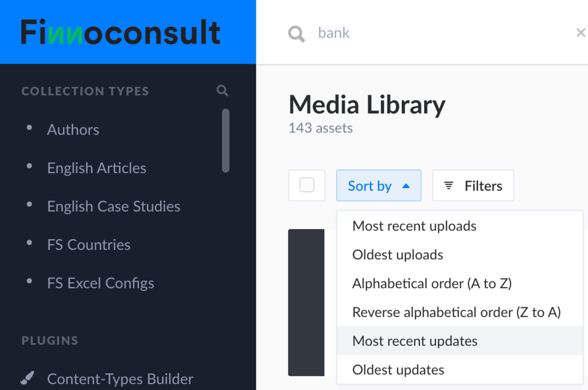
- You can also sort your results.
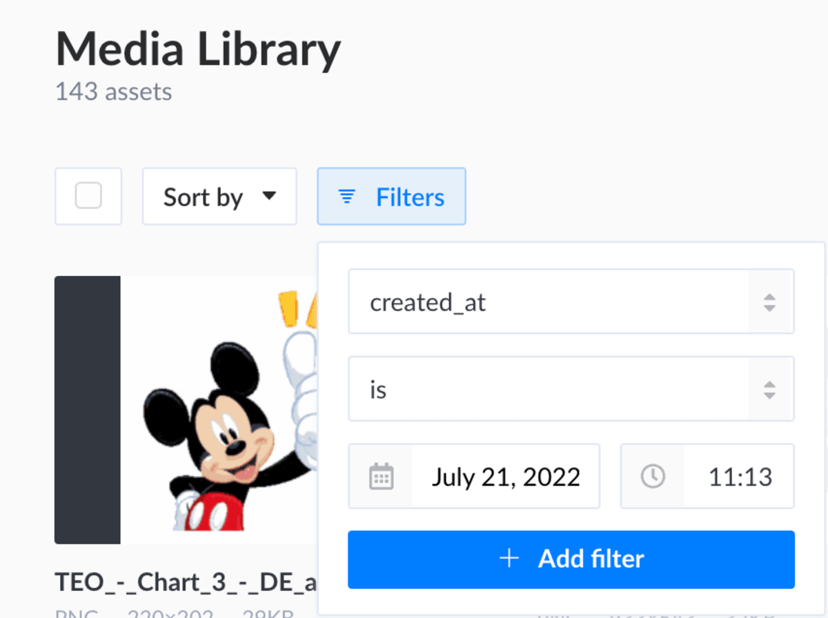
- Or filter them.
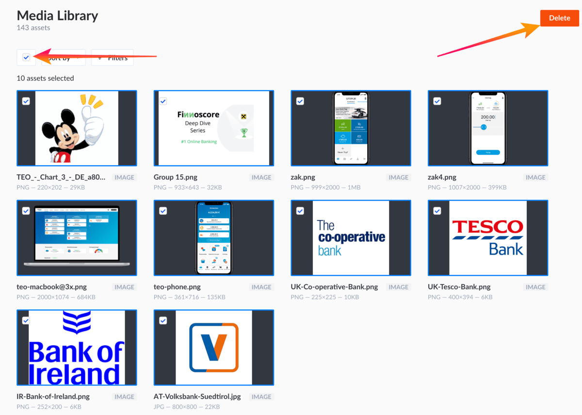
- Select all displayed asset & Delete all at once.
FAQ - troubleshoot with example use case - screenshots
Image is missing on XLS upload
If you notice that an image (bank logo) is missing, it is likely that the required asset is not uploaded to the CMS. Look at how to upload an asset to the Media Library

Overwrite a previous period selecting the same date
Be careful, if you don't want to overwrite an already existing file, don't use an upload with the same date!

XLS format - type or date selection is wrong
Uploaded file format should be XLS, XLSM or any Excel compatible extension.

Chart generator
Chart generator is available at: https://finnoconsult.at/de/charts/ link. Chart generator is only available for finnoconsult team members, therefore authentication is required. Currently 4 different charts are supported: History, Comparison, International, Multi
History Chart
- History chart is created to compare a specific institution's past with its current result.

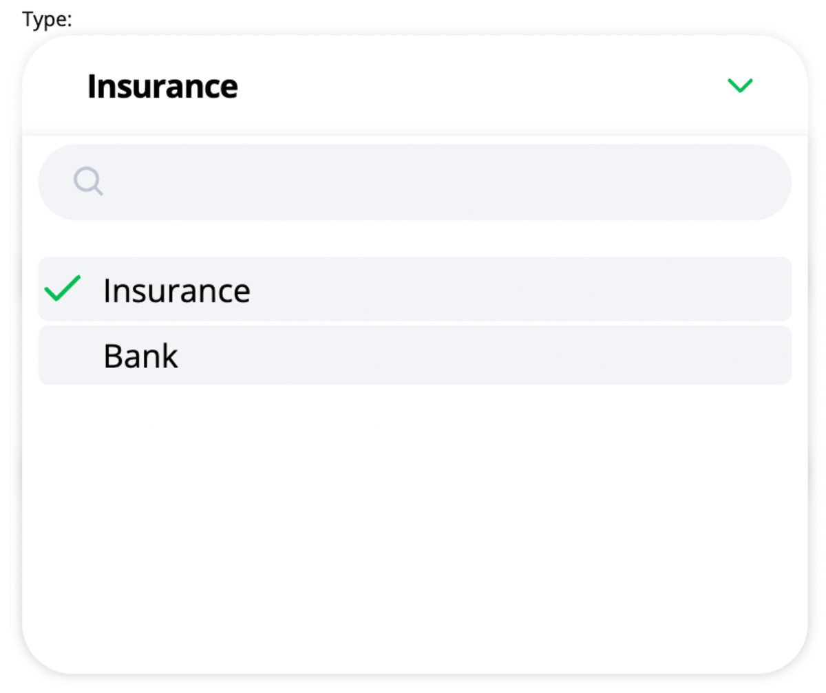
- Select the type: insurance or bank
- Select the two periods (relative & current)
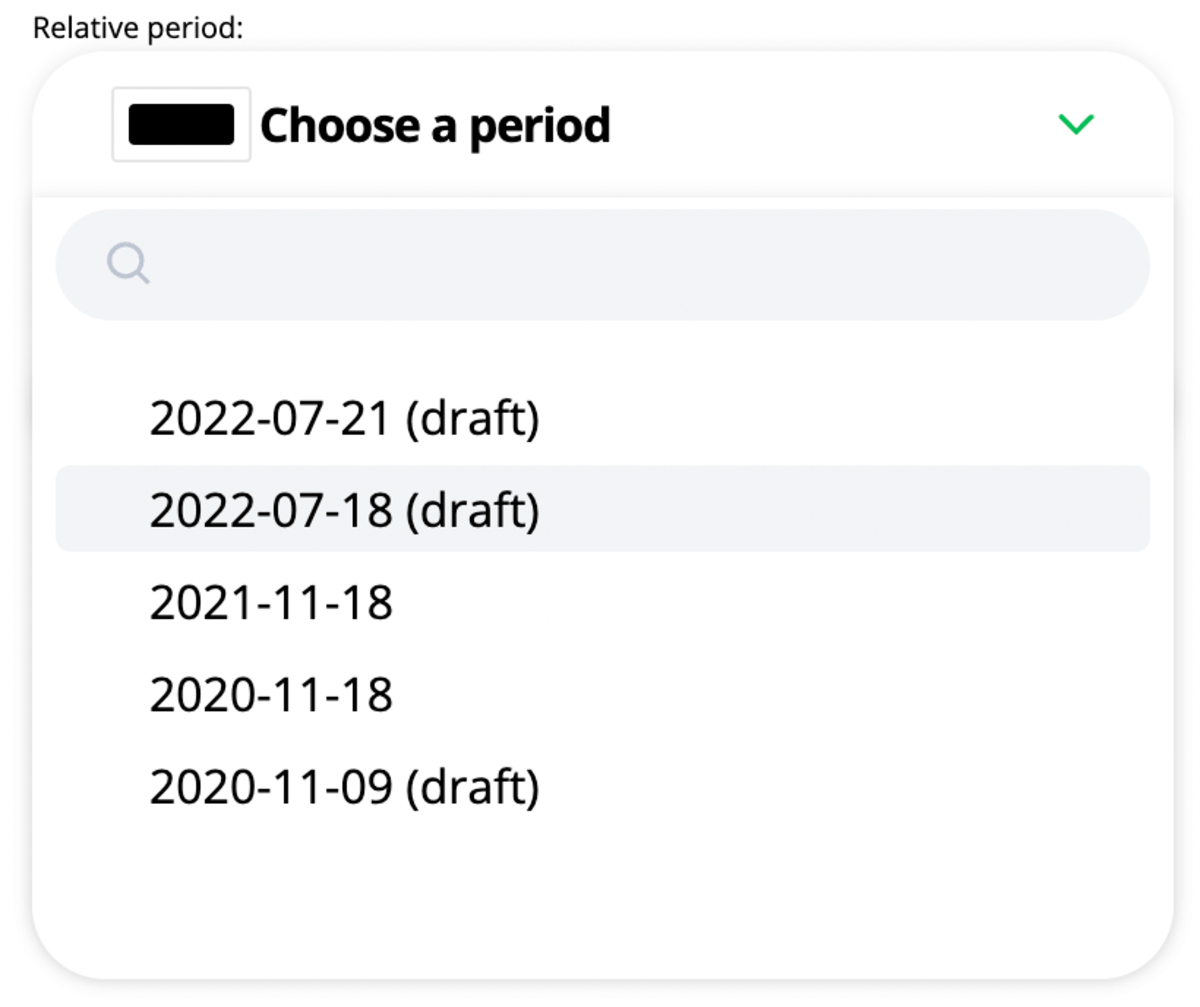
- Periods are labeled as a help, but it is important to remember that the first period is representing the past (relative), and the second period is the current state of the bank/insurance. Colors are also representing the different states.

- Only after this will the list of banks or insurances be available to us
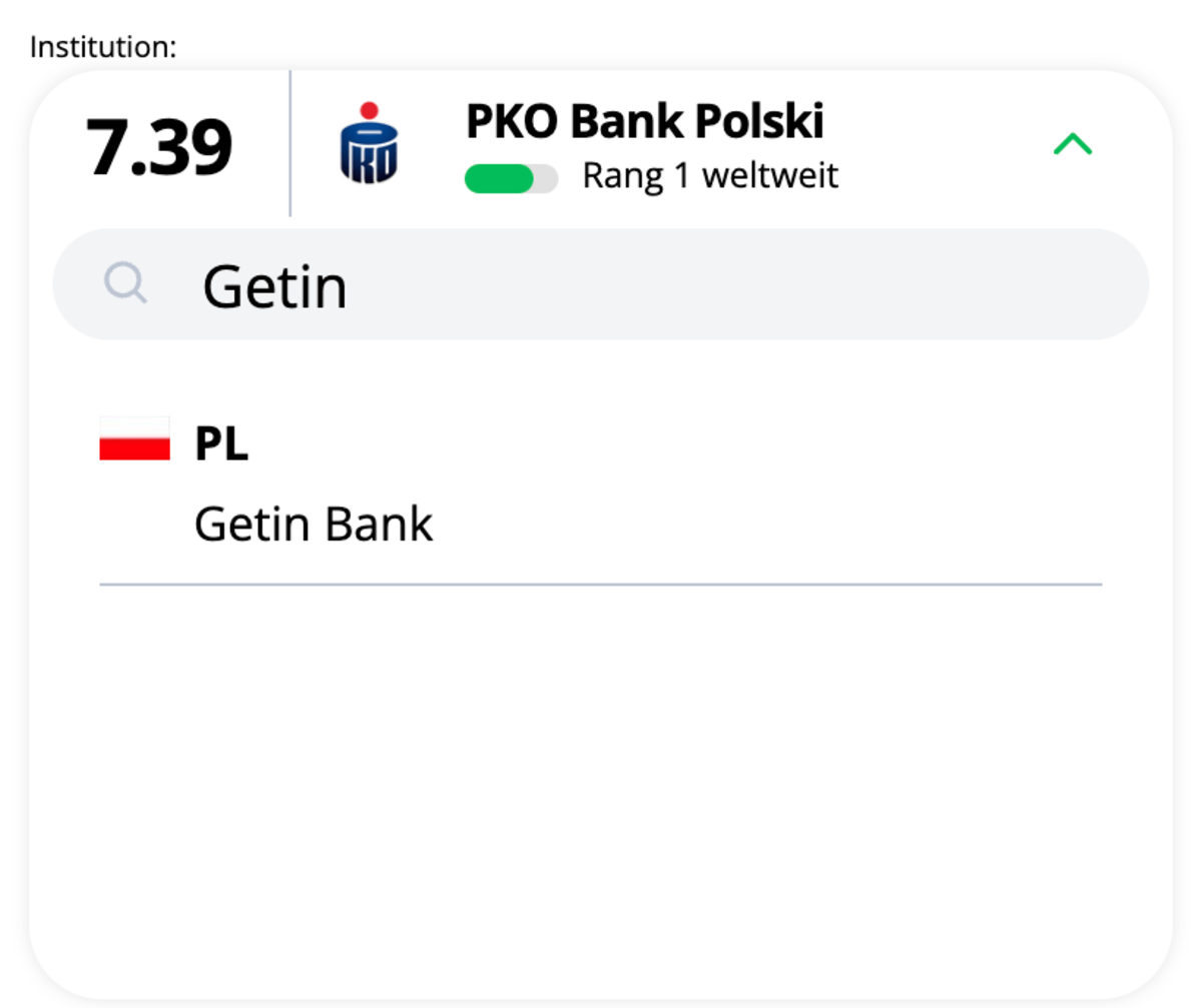
- The list is sorted by countries and has a search function

Comparison Chart
- Comparison chart is created to compare 2 Institution's result based on a specific period.
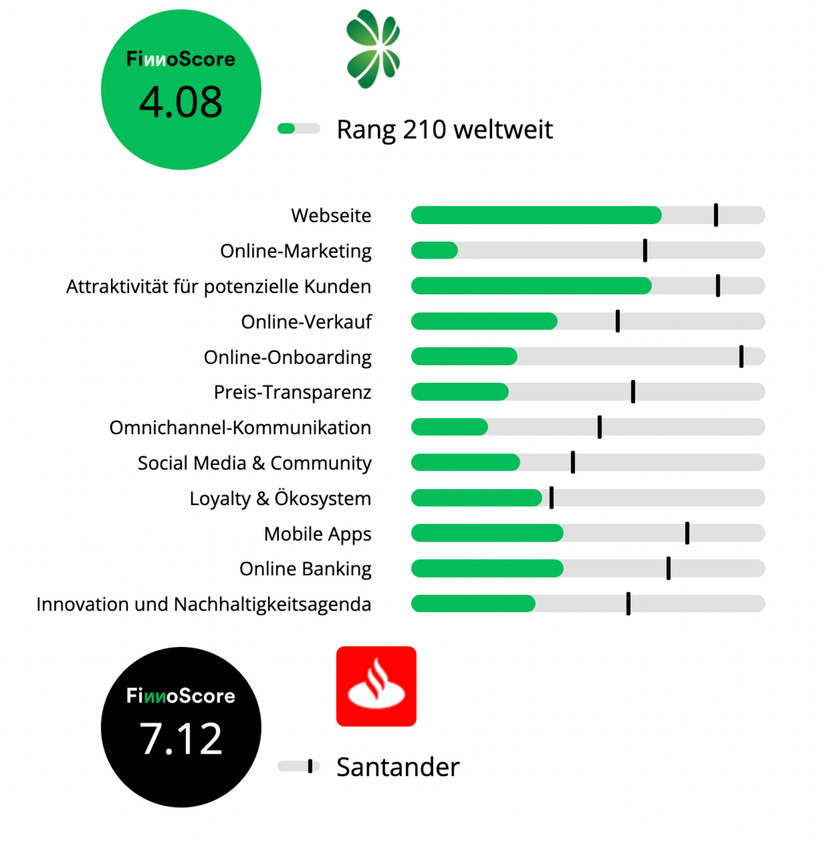
- Select the type: insurance or bank

- Select the period

- Select banks/insurances we would like to compare

- Compared banks/insurances are labeled as a help, but it is important to remember that the first dropdown is representing the past (relative), and the second dropdown is the current state of the bank/insurance. Colors are also representing the different states.
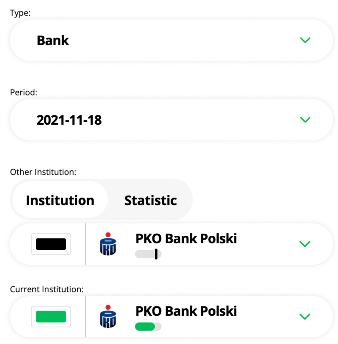
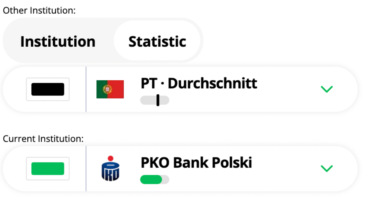
- In Comparison chart we can choose if we want to compare the current institution with a relative or country institution (Best/Average).
International Chart
- International Chart is created to see and compare the differences between top (best institutions by countries) with one specific institution.
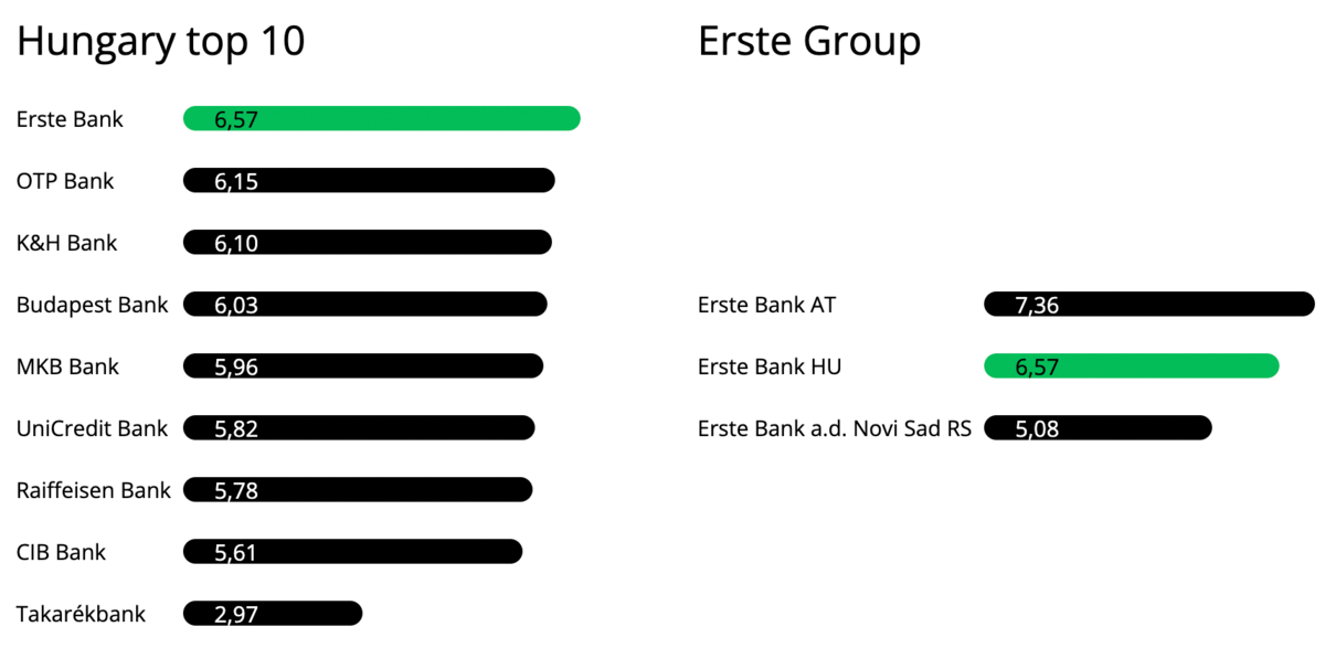
- Select the type: insurance or bank

- Select the period

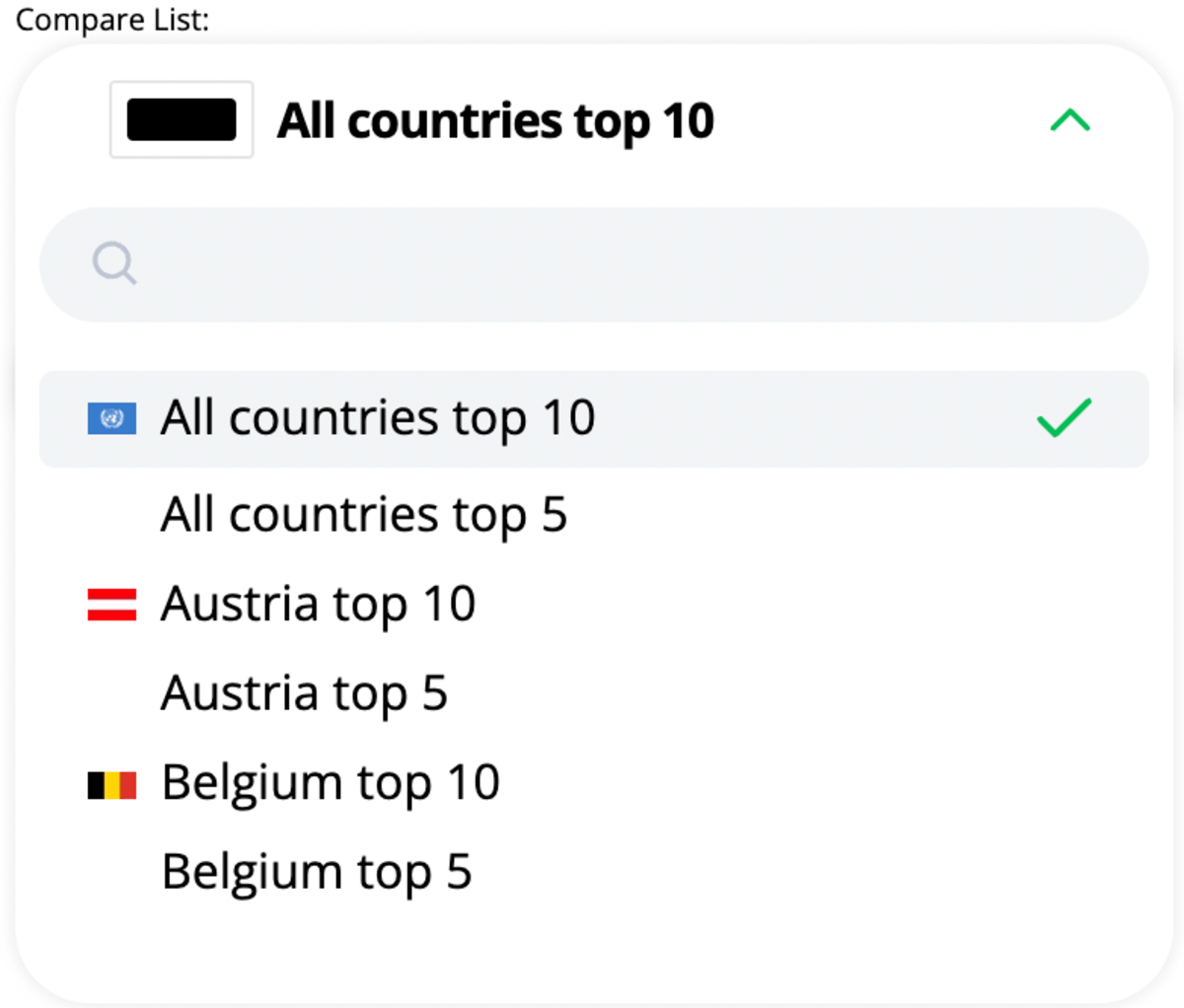
- Select the top institutions you want to compare. It is ordered by countries: Austria top 10 | Austria top 5...
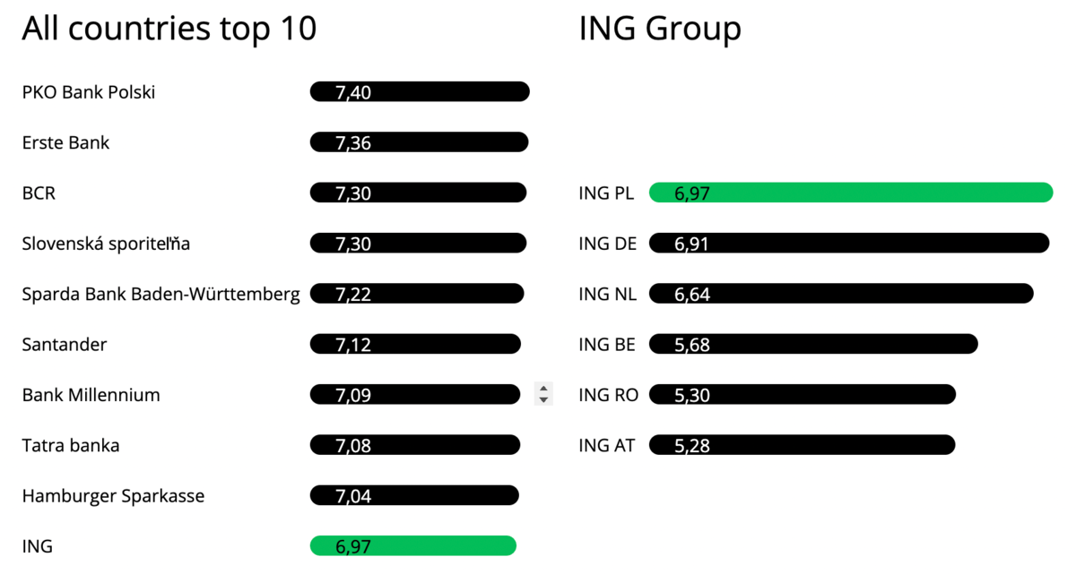
- Second selector is the current insitution. If it is present in the top/best list than it will be shown in the left chart and also in the right chart where we display the current bank group. Bank group represent the same banks, for example if we choose ING, we will see all the ING banks in different countries.

- We should see the indication of the country after the name of the bank.
 |
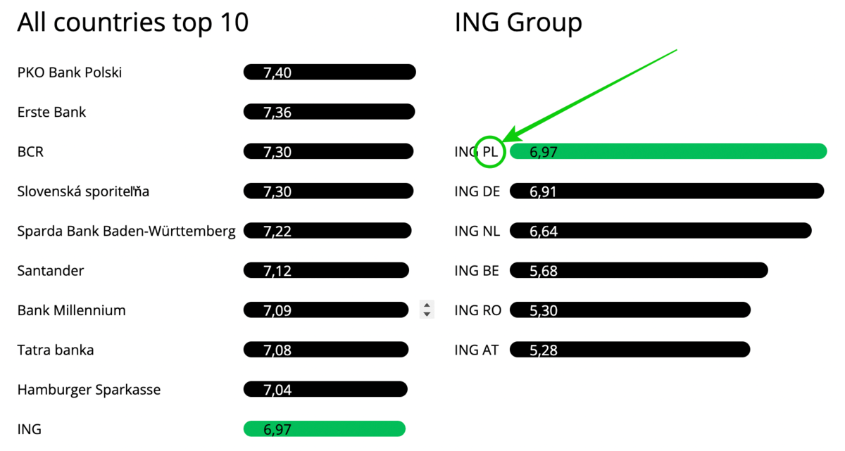 |
Multi comparison chart
- Multi chart is representing the differences of 4 type of institutions. Top national, Best worldwide, Past andCurrent state of a choosen institution.
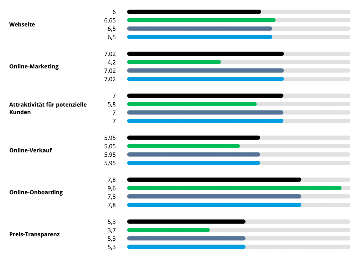
- First we have to select the type: insurance or bank

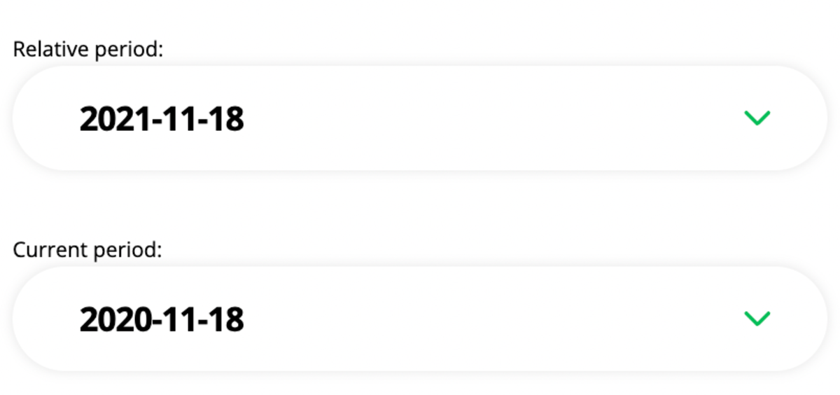
- Select the two periods (relative & current)
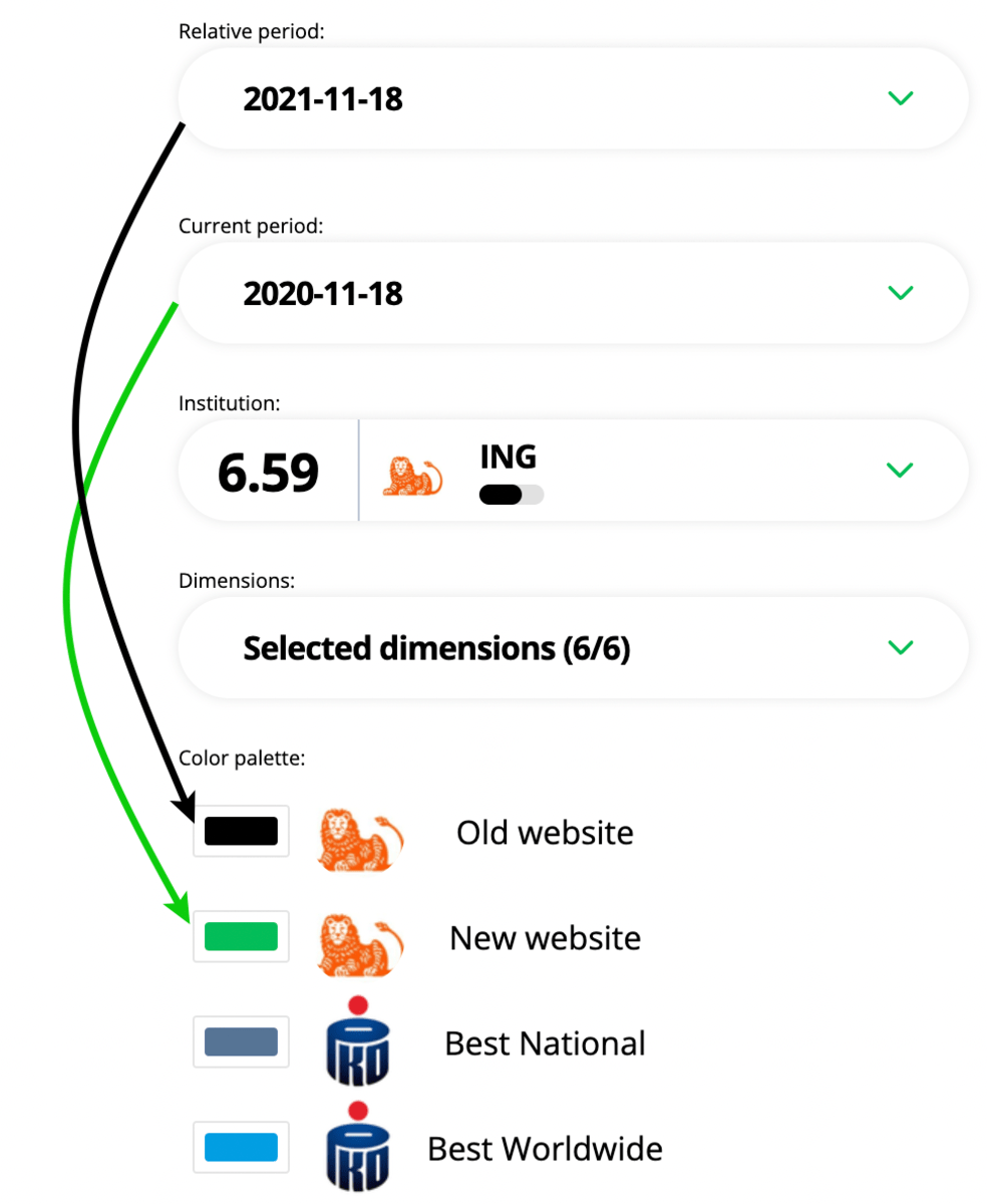
- Then select the institution. It will grab the past (Last year) and the current (This year) statistical data of the institution.

- We can see the connection between periods - institution - color picker section in this picture.
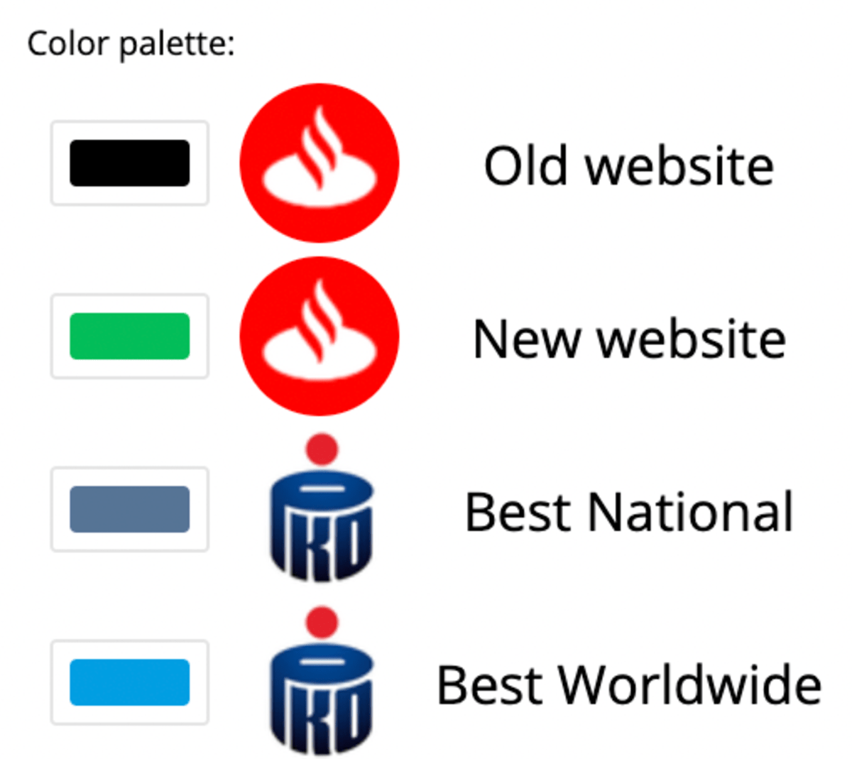
- We can change the default colors of the different institutions.
- Then select the dimensions we want to display. The limit is 6 dimension, we have to deselect a dimension if wehave already 6 selected, and then select a new one.
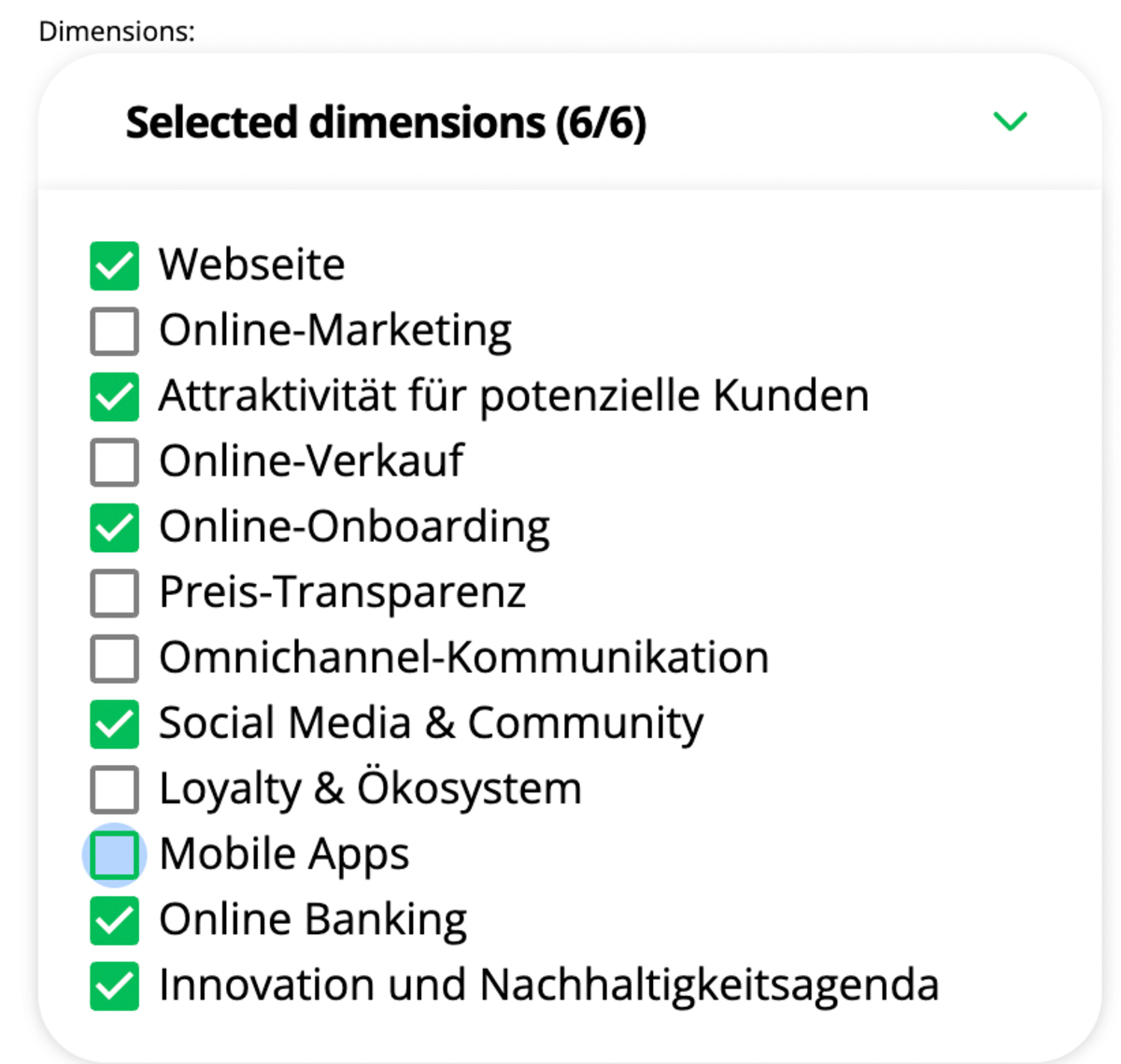
- With multi chart we not only able to display multiple institution's data but we are able to download multiple things like the chart or the legend.

How to edit chart data
- Almost every data editable in chart generator.

- From top to bottom, titles, labels, bank names or ratings. For editing, you have to double click on the text you would like to change.
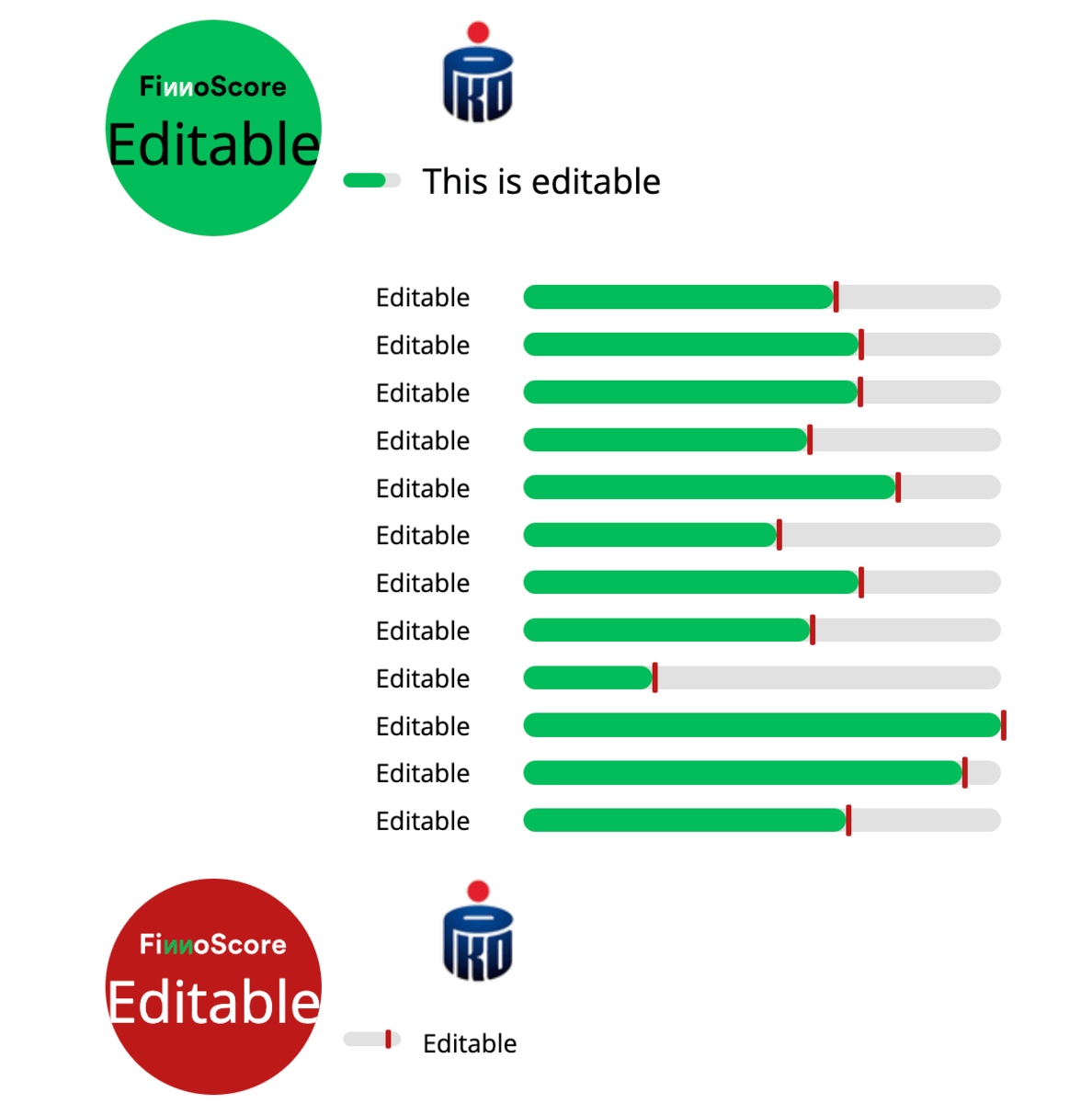
- Even the bars, we can increase or decrease bar percentages (Fill/Monochrome).

- or position status indicator. We can do that with the inputs next to the bars. Inputs are only visible when we hover over (take the mouse over) the input option.

- Most of the charts are edited with Drag & Drop feature, both the green bar and black line can be amended. You can see the drag indication, which you can see on hovering your mouse for the right side of the green bar, or exactly on top of the black line.

- International chart bars are also editable. There we only have one bar to edit.


- Multi chart is also editable in the same way as the others.
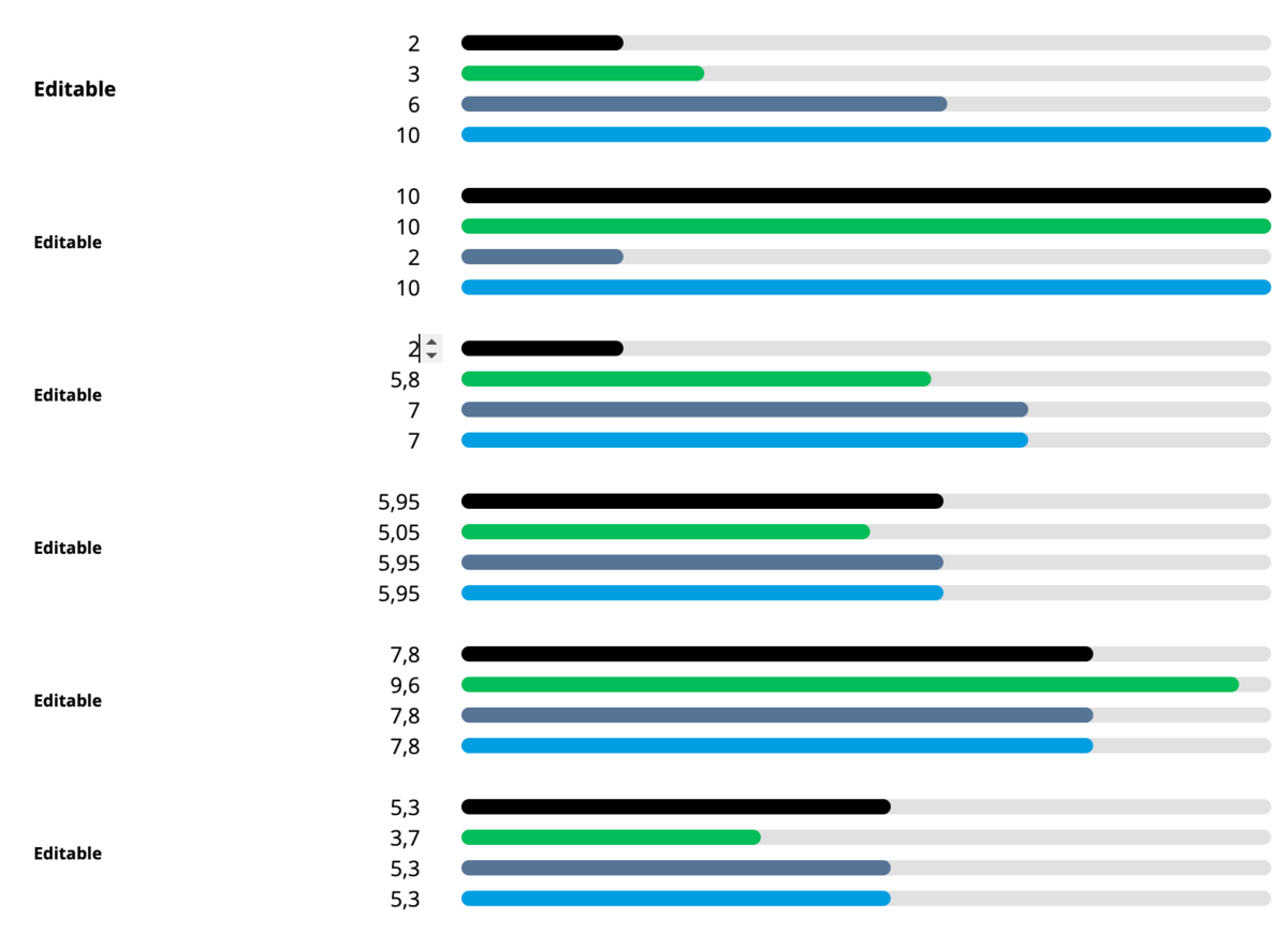
- You can update the color of the actual bars on clicking, mostly on the left side of the actual dropdown:

Save Chart images
Charts can be exported in two ways.
1. PrintScreen with Command-Shift-4. A cross-hair cursor will appear and you can click and drag to select the area you wish to capture.
2. Export button: Download chart. Available for all charts.
- Select the folder where you want to save the image.
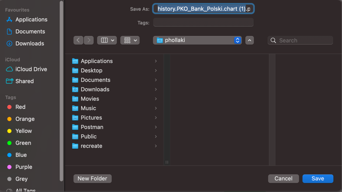
- If download is completed you should see it at the bottom of your browser, Double click on the file!

- Cut out the part of the image we need (Drag with left click on your mouse)
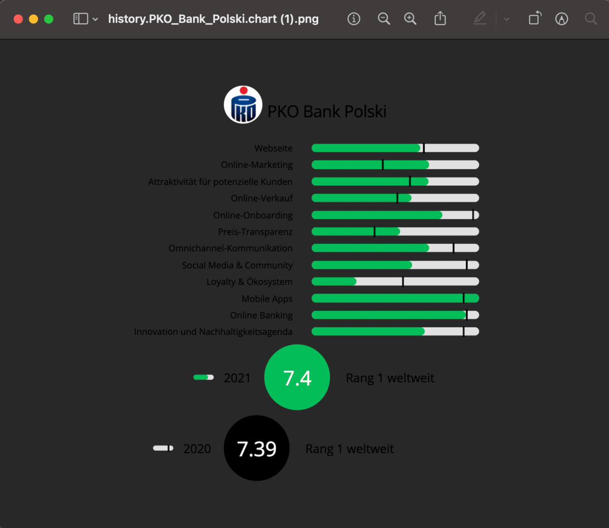
- With Command-V or choose Edit < Paste on Mac or CTRL + V on Windows we able to paste in our transparent image
