“The Ideal Bank” – #1 Daily Banking
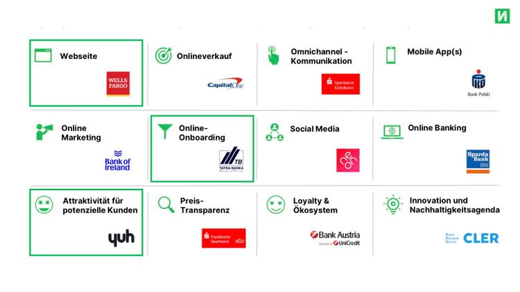
What would an ideal bank look like? In our new series “The Ideal Bank” we analyse the winners of the 12 dimensions of the Finnoscore 2022.
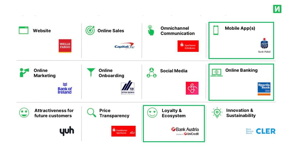
Bank customers are in contact with their bank on an almost daily basis. The daily banking aspects are therefore particularly important. They can convince customers and commit them long term. At the start of our series, we would therefore like to focus on three dimensions of daily contact with banks: Online Banking, Mobile App(s) and Loyalty & Ecosystem.
What can we actually learn from the winners of these dimensions?
Online Banking
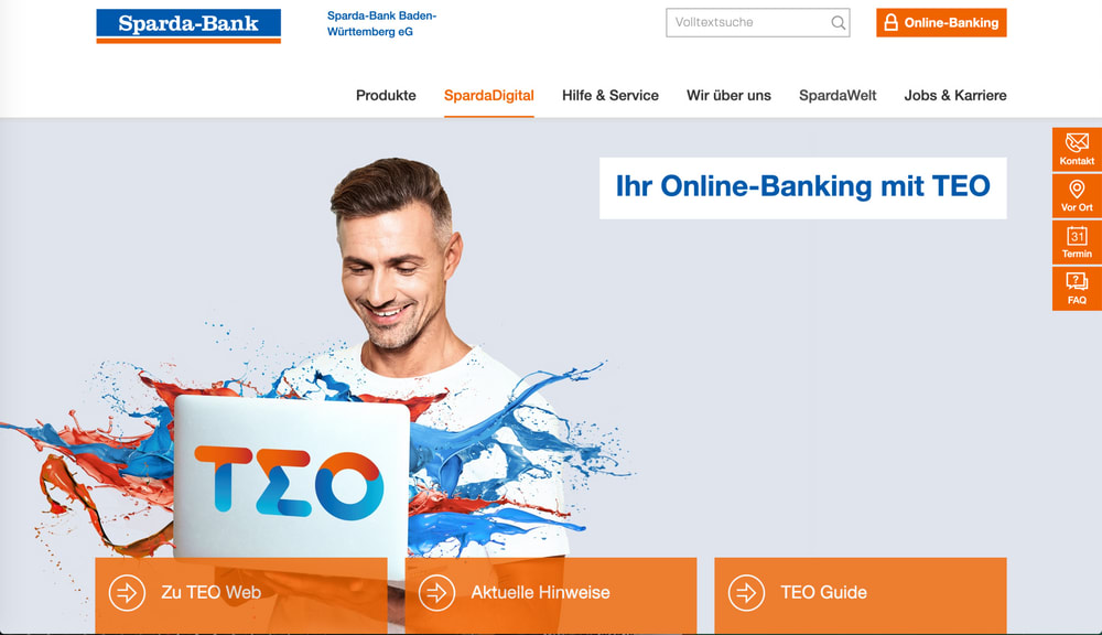
There is a good reason why Online Banking is one of the 12 dimensions of the Finnoscore: together with the use of the banking app, it is the central point of contact with bank customers. Performance in terms of online banking therefore significantly affects the perception of a bank. Together with mobile banking it is one of the most important Finnoscore categories. In this category, Sparda Bank BW is clearly ahead in the Finnoscore ranking.
What is particularly positive?
- A clear and appealing description of online banking and its functions can be found with just one click on the homepage. There are also many further links for customers who are looking for more information.
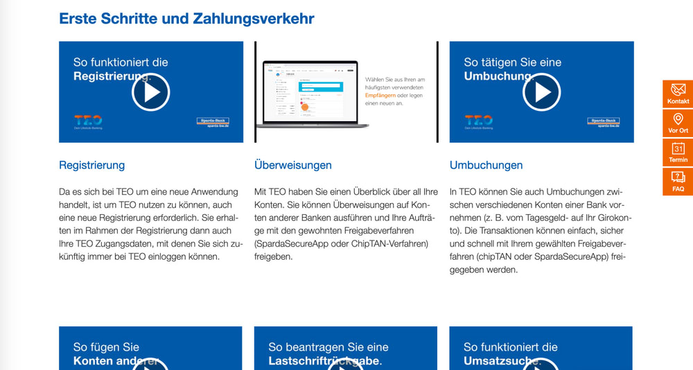
- Tutorials are easy to find on the site and cover many different topics. This gives a good impression of the product and supports existing users.
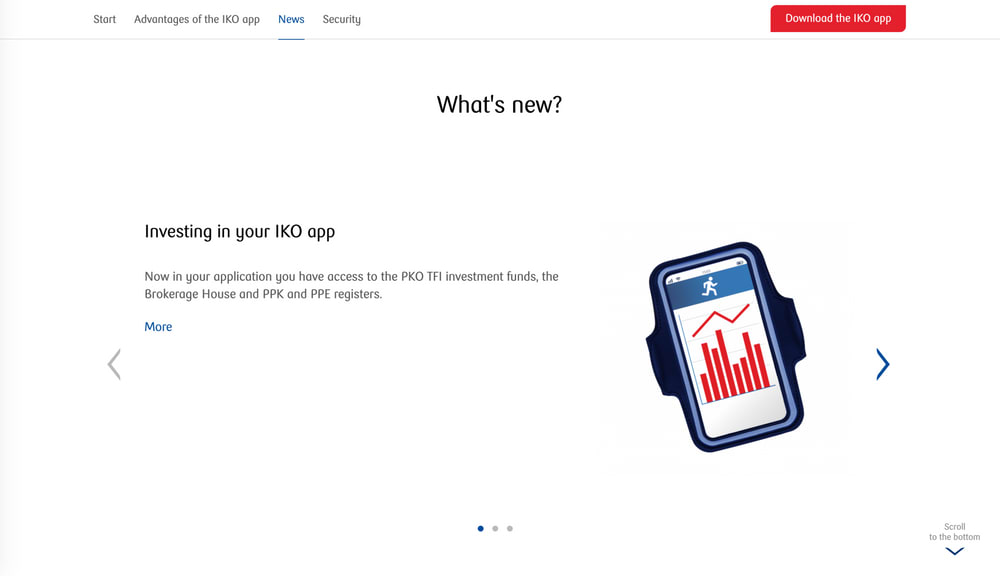
- There is a separate page on which new online banking features are presented. This can be accessed directly from the homepage.
TEO is the name of the Sparda Bank BW Online Banking Tool. In addition to classic online banking, it offers many other innovative and useful features. These include, for example, multibanking, account balance forecasts, insurance managers or savings boxes.
In addition, Sparda Bank BW offers a demo version of its TEO online banking tool, with which potential new customers can get a good impression of the product. With these features, Sparda Bank BW gives both its existing and potential new customers a good and clear insight into its online banking offering.
“Sparda BW relies on a very holistic approach that supports both potential new customers and existing customers very accurately. The simplicity of the digital offer is not only frequently verbally emphasised, but also very clearly illustrated at many points of the digital user journey.” Chris Berger, Co-Founder Finnoconsult
So what can we learn from our best practice example?
- Access to online banking must be quick and easy to find on the homepage
- The most important features and advantages of online banking must be presented clearly and concisely for interested potential customers.
- Tutorials or demo versions make it easier to make decisions and can create initial enthusiasm.
- Online banking is now standard practice. Banks can add value by including innovative and useful features.
Mobile Apps
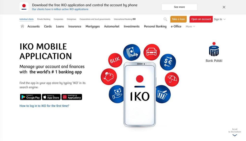
In the area of Mobile Banking, Bank Polski is the clear winner of the current Finnoscore 2022.
Why is Bank Polski the leader of the pack in the Mobile Apps Dimension?
- The homepage refers to the mobile app directly and on the same level as online banking. You can immediately see on which operating systems the mobile app works. That eliminates any customer confusion as to whether they can use the app.
- The fact that the app won the Retail Banker Award creates additional trust and credibility.
- Bank Polski has its own page with information about the mobile app. The most important features are simply explained there, and new ones are introduced.
- There is a tutorial that explains how to install and activate the app.
The app scores excellently in the App Store and Google Playstore with 4.8 stars. The functions of the app are described briefly and clearly in the app stores. A small improvement idea: Appealing videos, in addition to the pictures of functions, would make the app even more appealing.
The classic banking functions of the app are explained directly on the website in addition to the information in the App Store. There is a short, appealing description of the basic functions. If more information is needed, there is a complete list of all functions and a clear table of what the app exactly does.
In addition, the app offers functions such as “Acquisitions and Investments” and insurance offers such as travel or accident insurance directly in the app.
So what can we learn from our best practice example?
- The mobile app and its advantages need to be clearly and prominently displayed on the homepage.
- Features need to be explained clearly, briefly and concisely on the website and in the app stores.
- Trust-inspiring information like good App Store ratings and awards help with the decision to download.
- Direct links to the individual app stores should be available at every point in the customer journey. This facilitates quick downloading.
- An exciting range of functions can set you apart from the competition.
Loyalty & Ecosystem
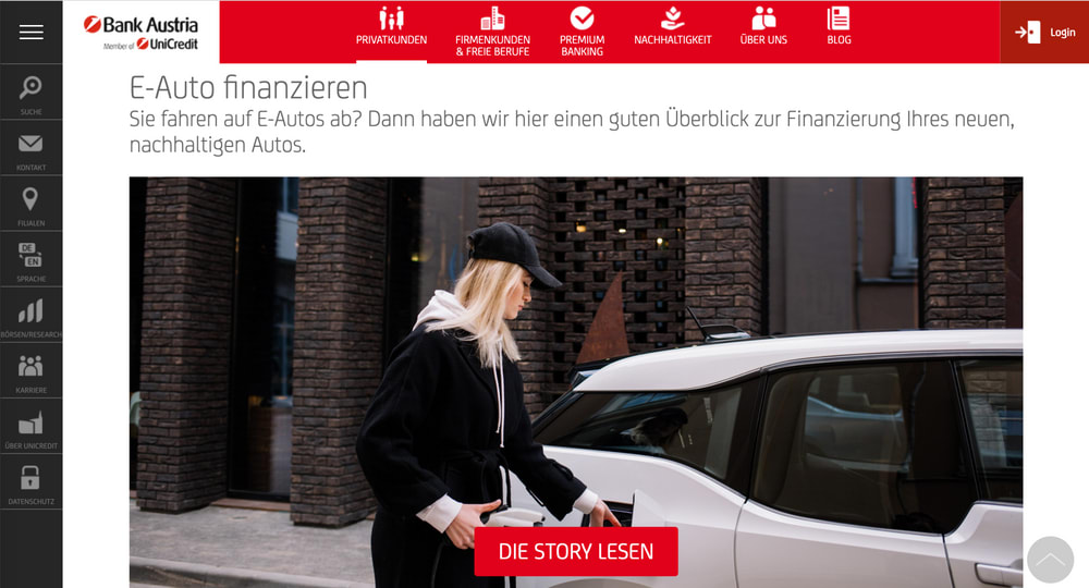
Customer loyalty is an important criterion for long term success. Here, Bank Austria of the Unicredit Group, offers a best practice example we can learn from.
What does Bank Austria offer its existing and new customers?
- Special offers and discounts for Bank Austria customers, such as discounted concert tickets
- opening vouchers at popular and well-known stores
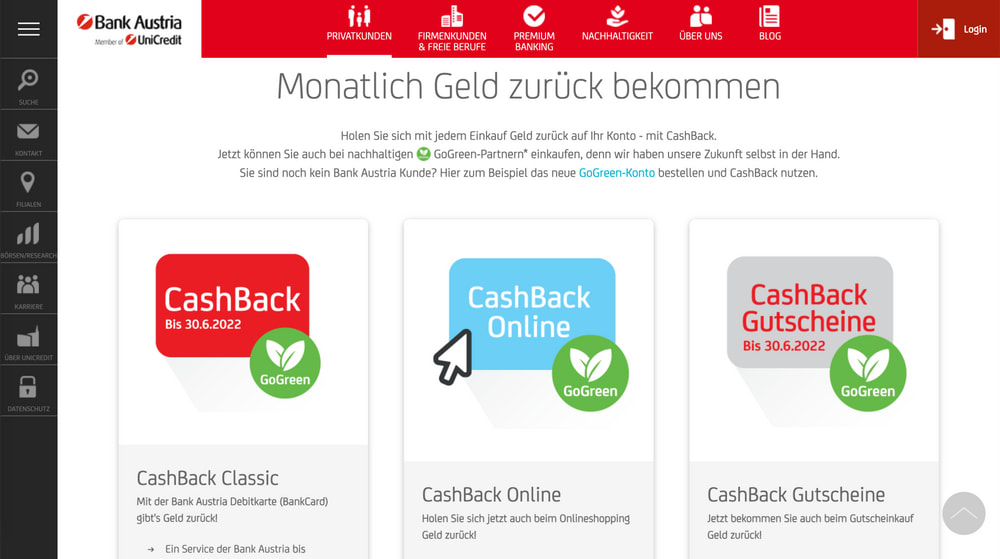
- A comprehensive cashback programme attracts new customers and brings added value for existing customers.
- All loyalty and voucher programmes fit with the corporate identity and support the strategic agenda of Bank Austria as a sustainable bank.
Bank Austria offers its customers a very comprehensive cashback programme. Payments with the Bank Austria debit card and online purchases via a partner's portal are automatically included. Cashback vouchers are also available via a voucher portal. There is a small minus point with the programme payout: Cashbacks are not credited directly with the purchase, but only at the end of the month or even after the end of the return period.
Bank Austria places great emphasis on sustainability in its loyalty programmes. This creates an interesting differentiating factor. This sustainability agenda is also reflected in other loyalty systems: There is a voucher for taking out an online loan for sustainable products (such as financing an electric car).
The cashback programme is also used intensively in the advertising for new customers: It is presented as one of the reasons for opening an account with Bank Austria
Bank Austria does not have its own marketplace for its loyalty programmes. But it does a great job of cleverly integrating its partners into its brand philosophy.
So what can we learn from our best practice example?
- Loyalty programmes and their benefits must be clearly visible on the website.
- It must be very easy for customers to join loyalty programmes. Preferably automatically.
- It makes sense to present programmes and offers that support the agenda and strategic course of the bank.
- Loyalty programmes must also be offered to new customers as benefits when opening an account.
- External partners must be aligned with the bank's positioning and match the rest of the offerings.
In the next episode of our 4-part series, we will address the question of how you can best address and reach potential new customers.
Do you want to be at the top of the Finnoscore too?
If you want more details, subscribe to our FinnoBlog Newsletter . That way you will receive the other articles in our “The Ideal Bank” series on Finnoscore 2022 directly into your mailbox.
Drawing comparisons is important, taking action is more important.
Take the first step with us: we will show you what quick wins can look like for your bank. Contact us directly!









.jpg)


