"The ideal bank" – #2 Approaching New Customers
In the first post on the "ideal bank", we wrote about daily banking. In this part, we want to look at effective strategies for approaching new customers.

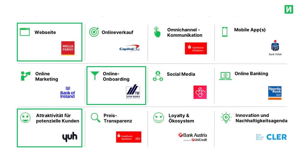
Three categories from the Finnoscore are important for acquiring new customers: website, online onboarding and attractiveness to potential customers. We can once again learn from the winners in these categories how banks outperform their competitors. One striking result of the Finnoscore 2022 up front: apart from Neobank Yuh, no bank from the DACH region is among the frontrunners. That should already give pause for thought.
So, let's take a look at the winners and how they scored:
Website
Wells Fargo
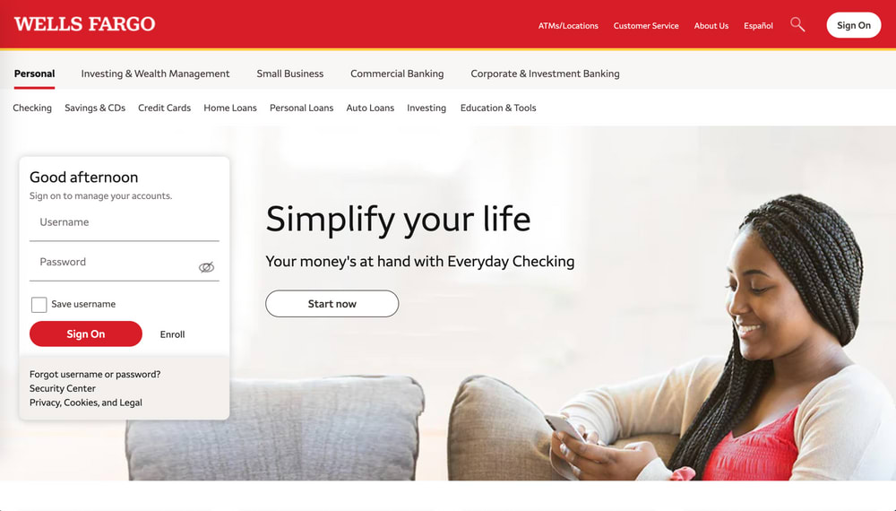
The website is the business card of every bank and the first point of contact for potential new customers. For this very reason, it's important to always keep your web presence up to date. Wells Fargo is the winner of Finnoscore 2022 in the website category.
What stands out about Wells Fargo?
- Important information on banking products can be found at a glance.
- The website clearly guides customers to the information they're looking for.
- Shortcuts to important features such as online banking, contact or mobile apps make it easier for customers to navigate.
- Varied UI elements liven up the website and make information more accessible.
Not only is the website responsive, but the components (such as navigation) are also specifically adapted to smaller screens.

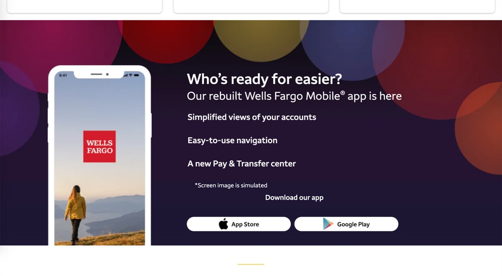
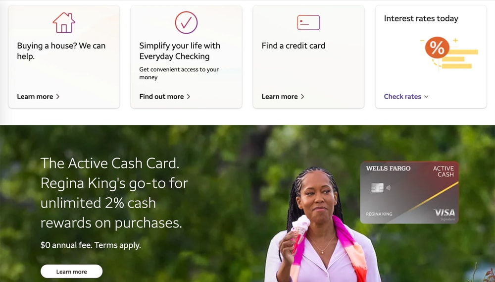
Wells Fargo has the edge especially in terms of scope and usability. The bank has a broad product portfolio, yet important information on opening an account or customer support can be found quickly by users. Wells Fargo uses different UI elements: images that stretch across the entire screen, image galleries and card design. A clearly visible search function helps to find specific topics. This allows customers to quickly find what they're looking for. The result is a satisfying user experience!
There is clear potential for improvement in the design of the website: it corresponds to the bank's CD, but a modern, visually contemporary appearance could make the customer experience even more appealing.
So, what can we learn from our best practice example?
- A clear and easy-to-understand menu is especially important for traditional providers with a wide range of products and services.
- A consistent website structure makes it easier for users to find their way around your website. This helps them quickly find the right offer.
- The most important and most sought-after information should be accessible via shortcuts.
- The design of the website should be geared towards the most important target group and address them directly. Naturally within the bank's CD.
- Appealing pictures, graphics, etc. create a pleasant user experience.
Online onboarding
Tatra Bank
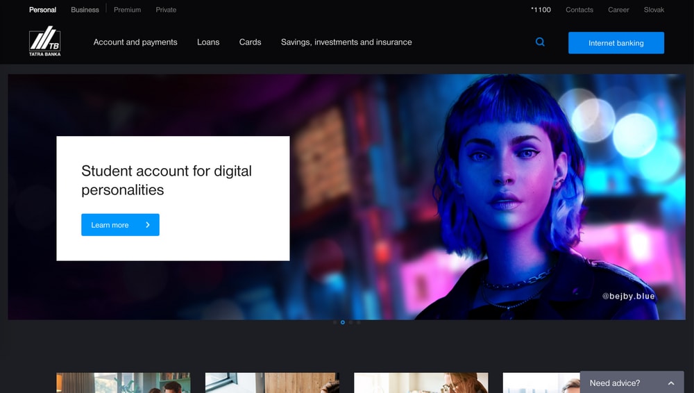
Customers' expectations of online onboarding are becoming ever higher. Everything needs to be simple, fast and direct. Multi-part processes or long waits to activate an account are increasingly less accepted by clients. Tatra Bank, the winner of the online onboarding category, is doing a lot of things right in these areas.
What stands out about Tatra Bank?
- The process is presented in a simple and compact way. The user knows exactly what to expect, what documents are needed, etc.
- Time indications help to estimate the process. Exemplary: the account is activated immediately after onboarding.
- If questions arise during the onboarding process, clients can contact Tatra Bank
- Tatra Bank only asks for information that is absolutely necessary to open the account. This keeps the process extremely streamlined.


Tatra Bank manages to present its onboarding process in an attractive way. Clear step-by-step explanations are provided. The website provides all the necessary information to get through the onboarding process without any problems. There's also a video explaining the whole process for visual people.
Customers can complete the authentication process directly in the app. A photo of an ID card and biometric facial recognition are all that's required.
So, what can we learn from our best practice example?
- Less is more: of course, it's tempting to ask for as much customer information as possible. But with every unnecessary input field, the risk of losing potential new customers even before onboarding increases.
- Processes must be well explained, including which information, documents or tools are needed. This is the only way to ensure smooth onboarding.
- Authentication and activation should occur directly during the process. Channel changes and waiting times create tension.
- Processes should be designed in such a way that no external programmes or tools are needed. The standard offerings of the individual operating systems must be sufficient.
Attractiveness for future customers
Yuh
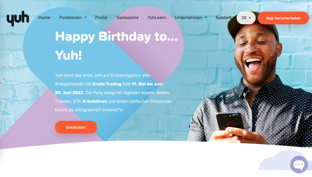
38% of the banks surveyed are geared towards new customers. Germany falls significantly behind with only 27%. Banks definitely have some catching up to do here. What has Yuh done particularly well as a Swiss neobank that other banks can still learn from?
What stands out about Yuh?
- Right on the homepage, two prominently placed and graphically eye-catching buttons invite you to download the Yuh
- The homepage is consistently designed to attract new customers and to advertise the individual services of the app.
- Benefits are formulated in an easy-to-understand manner and are supported by appealing illustrations.
- A short product video summarises all the advantages once again.
Both the website and the mobile version are equally focused on addressing new customers.


The aim is to make it easy for customers to decide in favour of Yuh: The simple 3-step onboarding process is described in detail. In addition, videos with storytelling elements are available: Testimonials from real customers are meant to convince potential new customers.
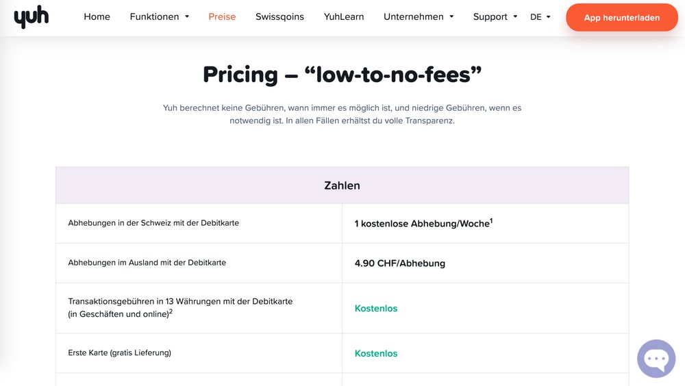
Prices and costs are quickly accessible via the menu navigation and are presented transparently. This allows potential new customers to quickly get an idea of which offer is suitable for them.
The design and language of the website are geared towards the young, digital target group. The functions of the app are explained in simple and understandable language. This creates a connection to the target group's everyday reality.
What can you do to be even better when it comes to addressing new customers?
- Guide visitors to your website and app to open an account as quickly as possible.
- Summarise the advantages of an account at your bank clearly and in a way that's relevant for customers. These selling points must be easy to find.
- Tailor your communication to the appropriate target group. That means using appealing and understandable language combined with storytelling elements. This applies especially to the advantages of opening an account with your bank, but actually to all areas.
- Modern graphic presentation and appealing key visuals create emotionality. This can be the decisive factor in choosing your bank.
Do you want to be at the top of the Finnoscore too?
If you want more details, subscribe to our FinnoBlog Newsletter . That way you will receive the other articles in our “The Ideal Bank” series on Finnoscore 2022 directly into your mailbox.
Drawing comparisons is important, taking action is more important.
Take the first step with us: we will show you what quick wins can look like for your bank. Contact us directly!


.jpg)